
Electricity Dashboard
Last updated: 18 August 2026
The Electricity Dashboard tracks your Scope 2 emissions — the indirect emissions from purchased electricity, heat, steam, and cooling — showing location-based and market-based calculations side by side. Use it to compare facilities, spot consumption trends, and see the effect of renewable energy purchases. Access it via Analyse > Dashboards > Electricity.
In this article, you'll learn:
- What each of the three headline metrics measures
- The difference between location-based and market-based emissions, with a worked example
- How to read the monthly trend and entity comparison charts
- How to filter the dashboard and what to check if it's empty
Key Metrics
Location-Based Emissions
Uses average grid emission factors for your region, measured in tonnes of CO₂e. This is the default and typically the higher figure.
Market-Based Emissions
Reflects your specific energy purchasing decisions — GreenPower, renewable certificates, or carbon-neutral electricity — in tonnes of CO₂e.
Total Energy Consumption
Total electricity consumed in kilowatt-hours (kWh) across the selected entities and period.
Location-Based vs Market-Based: A Worked Example
The location-based method asks: what does the electricity grid you're physically connected to emit, on average, per unit of electricity? The market-based method asks a different question: what did you actually buy? If you purchase renewable electricity, only the market-based figure rewards that decision.
Suppose your office consumes 100,000 kWh in a year, and the average grid emission factor for its state is 0.7 kilograms of CO₂e per kWh (an illustrative figure — real factors vary by state and year):
- Location-based: 100,000 kWh × 0.7 kg CO₂e/kWh = 70,000 kg = 70 tonnes CO₂e. Your purchasing choices don't change this figure — it reflects the grid itself.
- Market-based: say you buy GreenPower covering 60% of your consumption. The 60,000 renewable kWh count at zero, and the remaining 40,000 kWh are calculated at the applicable factor: 40,000 × 0.7 = 28 tonnes CO₂e.
- The gap — 70 versus 28 tonnes — is the measured impact of your renewable purchasing. If you bought 100% renewable electricity, your market-based electricity emissions would fall to zero while the location-based figure stayed at 70 tonnes.
This is why the GHG Protocol recommends dual reporting: location-based shows your dependence on the grid; market-based shows what your procurement decisions achieve. NetNada calculates both automatically from your uploaded electricity data and boundary answers.
Renewable Energy Is Detected Automatically
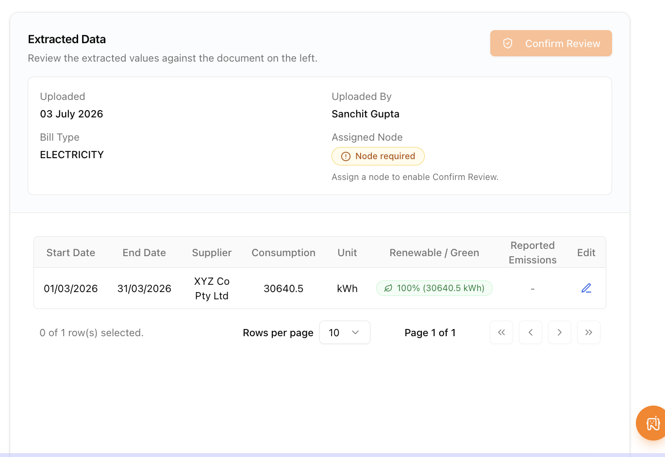
You don't need to enter renewable purchases manually. When you upload electricity bills, NetNada reads GreenPower allocations, green utility tiers, and behind-the-meter solar power purchase agreements straight off the bill and credits them to your market-based figures automatically.
Genuine renewable usage is distinguished from financial credits — items like solar feed-in exports or mandatory certificate charges are not counted as renewable consumption. Detected renewable volumes are logged to the audit trail, so your auditor can see exactly what was credited and why.
Monthly Trends
The monthly emissions chart shows location-based and market-based emissions over time. Use it to spot seasonal patterns (such as higher cooling loads in summer), identify anomalies like a month with a missing bill or a duplicated upload, and watch the two lines diverge as renewable purchases take effect.
Emissions by Entity
The entity chart splits total Scope 2 emissions across your selected nodes — facilities, projects, or products — so you can compare sites directly. This is where you identify which locations have the highest energy intensity, and therefore which would benefit most from efficiency upgrades or a renewable electricity contract.
Filtering the View
| Control | Function |
|---|---|
| Entity selector | Filter to specific entities. Only facility, project, and product nodes can be selected — these are the node types electricity emissions attach to |
| Date range picker | Set the month-and-year range shown in every metric and chart |
| Reporting period indicator | Shows whether your selected range matches one of your reporting periods, so dashboard figures line up with your reports |